# Theme configuration
Below is a list of the additional configurable features Yuu has to offer. All other configuration settings in VuePress's default theme config page are also available, since Yuu extends the default theme.
# Dark theme
Yuu, by default, comes with an option to allow users to switch to a dark theme. You can set this as the default theme via the defaultDarkTheme option.
module.exports = {
	themeConfig: {
		yuu: {
			defaultDarkTheme: true,
		},
	},
}
# Disabling the dark theme
You can also disable it entirely via the disableDarkTheme option.
module.exports = {
	themeConfig: {
		yuu: {
			disableDarkTheme: true,
		},
	},
}
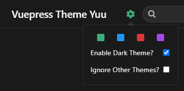
# Color themes
Yuu currently supports these color themes: green (default), blue, red, and purple. By default, any additional themes will be included. If you only want to use certain themes, you'll need to be explicit about which ones.
module.exports = {
	themeConfig: {
		yuu: {
			colorThemes: ['red'],
		},
	},
}
# Default color theme
You can also set the default color theme via the defaultColorTheme option.
module.exports = {
	themeConfig: {
		yuu: {
			defaultColorTheme: 'blue',
		},
	},
}
# Set color themes per page
You can set themes on a per page basis as well. Using YAML frontmatter on the page(s) you want to display a specific theme:
---
pageTheme: blue
---
# Disallowing themes from being ignored
Users will still be able ignore themes via the user settings dropdown menu. You can disable this via the disableThemeIgnore option.
module.exports = {
	themeConfig: {
		yuu: {
			disableThemeIgnore: true,
		},
	},
}
# Labels
You can update the text for the dark theme and theme ignore labels inside the dropdown menu via the labels setting.
module.exports = {
	themeConfig: {
		yuu: {
			labels: {
				darkTheme: 'Dark theme?', // Default is "Enable Dark Theme?"
				ignoreThemes: 'Ignore themes?', // Default is "Ignore Other Themes?"
			},
		},
	},
}
# Extra options
If you want to add your own options to or around the dropdown menu, you can do so via the extraOptions setting. The strings provided are the names of the components to use (most likely located in your docs/.vuepress/components/ directory).
module.exports = {
	themeConfig: {
		yuu: {
			extraOptions: {
				before: 'BeforeContent',
				after: 'AfterContent',
				above: 'AboveContent',
				below: 'BelowContent',
			},
		},
	},
}
before and after will be placed before or after the cog icon, and above and below will be placed inside the dropdown menu, above or below the default Yuu options. You can target these elements in your CSS with the selectors .user-options-before, .user-options-after, .user-options-above, and .user-options-below.
# Custom home layout
If you want to use your own home component when using the homepage frontmatter option, you can use the homeComponent setting.
<!-- docs/README.md -->
---
home: true
homeComponent: CustomHome
---
<!-- docs/.vuepress/components/CustomHome.vue -->
<template>
	<div class="homepage">
		Custom homepage
	</div>
</template>

<style lang="stylus">
// These variables are available from the default theme
.homepage
	display: block
	max-width: $homePageWidth
	margin: 0 auto
	padding: $navbarHeight 2rem 0
</style>
# Custom logo
If you want to use your own logo component instead of supplying the title and logo config options, you can use the logo setting.
module.exports = {
	themeConfig: {
		yuu: {
			logo: 'YuuLogo',
		},
	},
}
This will override the default <router-link> on the navbar, so you'll need to provide your own. $localePath is used in the default theme.
<!-- docs/.vuepress/components/YuuLogo.vue -->
<template>
	<router-link :to="$localePath" class="yuu-logo">
		Yuu
	</router-link>
</template>